At some point, you probably heard that your emails need to “look more professional.”
A consultant, team member, or “best practices” article instructed you to create polished, heavily designed, visually striking emails because they “signal credibility” or something of the like.
I’ve seen it happen when speaking with potential clients and browsing job postings, too.
“Must have experience with HTML” or “can you design emails?” comes up more often than you’d think.
I get it. The logic is there. Design emails look like (and do take) serious effort to create.
And so it makes you look like you “take things seriously.”
The problem…
“Looks professional” and “performs better” are not the same thing.
In many cases, they’re at odds with each other.
So let’s talk about why plain text emails often beat design handily.
| Table of Contents |
| The Big Advantage: It’s A Real Communication Other Reasons Plain Text Has the Edge When Designed Emails DO Make Sense Mostly Plain Text + Light Design = Optimal What To Do Next |
The Big Advantage: It’s A Real Communication
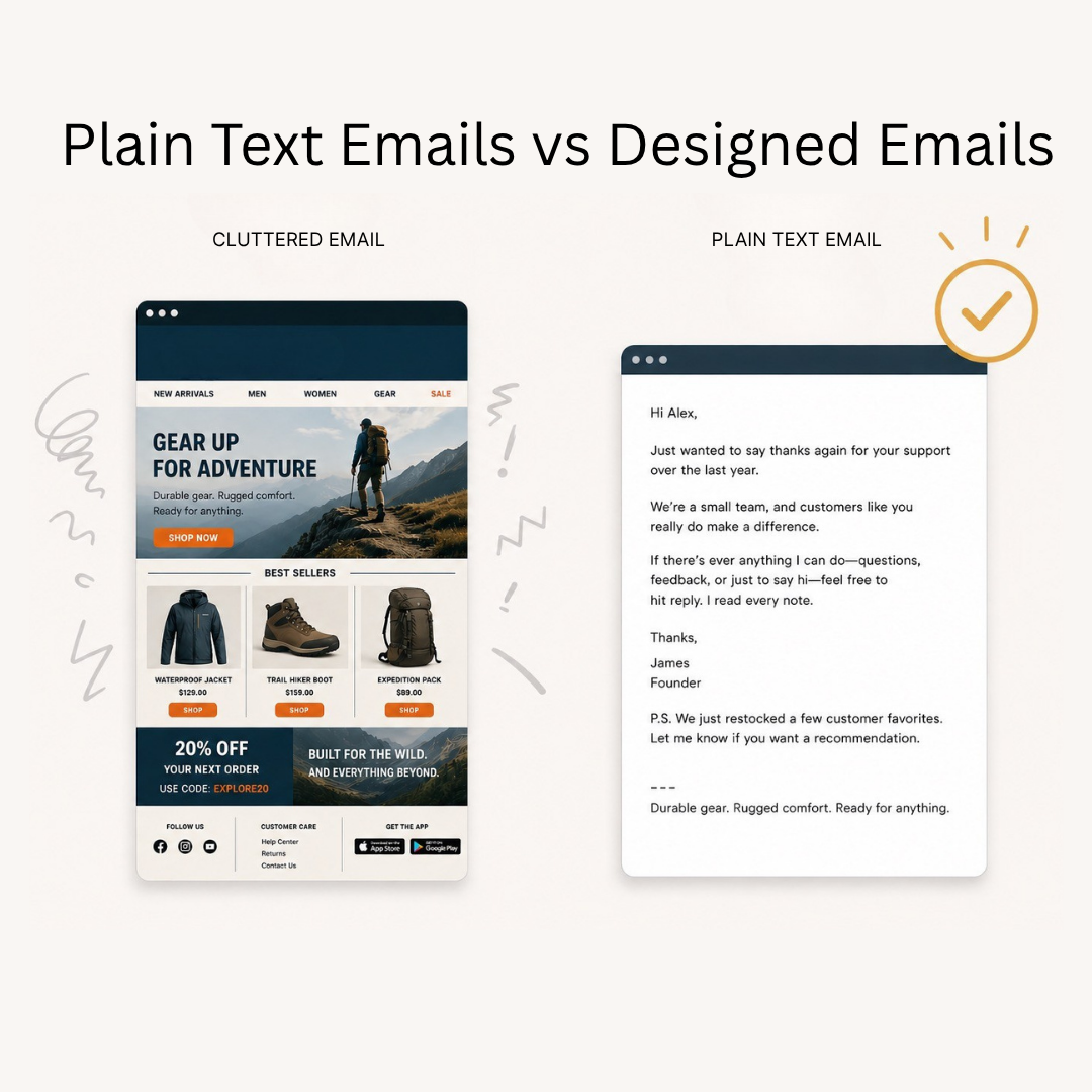
Open your inbox and look at the emails sitting there.
Bet you some of them look like ads.
Big branded headers, product images, bold colors, multiple buttons, sleek visuals…
You immediately know a marketing department put that together.
Sure, you may like the brand, but it just feels like “marketing.”
So you dismiss it right then and there.
And then…
There are plain-text emails.
These look like someone actually wrote to you, consisting mainly of:
- A block of text
- A simple signature
- MAYBE an image for emphasis, humor, or personalization
But the feel is much more personal. Even if the reader knows John Founder himself isn’t writing the email, it still leaves them with a different (and better) impression.
Think about direct mail for a second.
A handwritten or even typed letter you dig out of your mailbox is much more exciting to open and read than a glossy, colorful postcard with sale prices and product photos.
Both could be asking for the sale. But the first feels like a valuable communication.
People read letters more eagerly than billboards.
NOTE: More brands are writing plain text these days, but that’s thanks to AI… and a lot of it unfortunately sounds like slop. Here’s a way to sharpen that AI output so it doesn’t sound like slop.
Other Reasons Plain Text Has the Edge
Plain text has a few more advantages over design emails:
1. Deliverability & Performance
Heavily HTML emails carry more baggage, both technically and perceptually.
On the technical side, emails loaded to the gills with HTML and design elements are more likely to get flagged by spam filters (or sent straight to the trash) or sorted into the Promotions tab.
Plain text is lighter and cleaner.
It lacks the complex code and other spam-triggering elements found in the heavily HTML stuff — email providers treat them as personal, one-to-one communications.
On the perception side…
Even when a heavily designed email reaches the Primary inbox, the reader’s mind immediately flags it as “marketing.”
They skim it, ignoring all those elements you worked so hard for to hunt for any relevant sale. If they don’t see a compelling offer, they leave.
Oh, and these emails can take longer to load.
Certain elements or the whole thing may sit there struggling to render, and even brief delays are enough to lose a LOT of readers.
Plain text loads almost instantly, and even if they know it’s marketing, they don’t just flag it as “ad to ignore.”
Many readers READ the thing because they figure there might be some useful lesson or good story inside.
One last thing:
Plain text emails lend themselves to replies and give you opportunities to explicitly ask for replies.
Replies are good for deliverability and list health because, again, it tells the email provider you’re someone worth interacting with.
2. Speed of Production
Design emails have many moving parts:
- Colors
- Layout
- Image assets
- Copy blocks
- Buttons
- Mobile QA (see subsection 4)
All of that has to be planned out and built before you can send the email.
And if anything looks off in the process, you have to go back and fix it.
Think of how long that takes.
It might even require a designer (in-house OR outsourced), meaning you rely on someone else to execute on your vision.
A plain-text email is just writing. At most, maybe a light design element or two that’s mostly auto-loaded in via a template.
If you can speak to your audience’s problems and pains, and tell decent stories, you can write emails that sell.
This matters especially now that AI is in the picture.
Many assume AI levels the playing field for designed emails — and it helps, no question.
But nailing design assets involves visual judgment, brand consistency, and many variables that are harder to delegate than writing.
Telling an AI to write an email that sounds like you is simpler than getting it to produce a visually polished template that looks exactly right.
Words either make sense or they don’t, but design has infinite ways to be slightly off.
Even hiring a professional to write plain-text emails for you is easier on all fronts.
Sure, you still have to communicate your vision to the copywriter… but it’s just words.
There’s less of that “mind to mind” distance for determining word arrangement vs. visual arrangement when executing on your vision.
And again, time investment. A copywriter can turn around 5 emails for you in the time it takes for a design agency to do 1 design.
3. Flexibility
Designed emails have an inherent bias toward being short.
There’s pressure to keep copy short since long blocks of text just look weird in these formats, most of the time.
So design dictates content, limiting what you can actually say.
Plain text lacks this constraint.
You can build an argument over hundreds of words, walk through a framework, or tell a customer story that takes a few minutes to read…
Or you can do a quick last call or “why didn’t you buy?”
Regardless, the format follows the content rather than the other way around.
Brevity is crucial, in that you shouldn’t write fluff. But a sharp, focused email that gets lots of reads, clicks, and sales could be 500 words long if every word does a job.
4. Mobile Readability
How often do you sit down at your desktop or laptop to read a marketing email you just received… when your phone is on you at all times?
Exactly. Never.
Everyone’s on their phone. So your email better be mobile-optimized…
And it just so happens that plain text has a big edge here.
Layouts can break, images can fail to load, and text that looks fine on desktop can become a jumbled mess on a 6-inch screen.
Even when it does render properly…
Readers often have to pinch zoom-in/out or scroll horizontally to see everything.
Such friction costs you readers.
Readers who stay don’t get the whole message because they can’t navigate the email in one direction. More likely to be confused, less likely to convert.
Plain text renders perfectly on every device without the same issues.
Nothing breaks or requires tons of screen movement to see things, generally speaking.
Combine that with lightning-fast load times, and plain text just works when someone is reading the email on the go.
5. Timelessness
Design trends move fast.
An email template that looked clean and modern a few years ago can feel dated today, whether due to trend changes or brand updates (each of which can impact colors, layout conventions, and visual expectations).
This matters because people may not recognize your emails after a brand update, and it becomes harder to reuse past winning emails.
Plain text emails are timeless in that they’re just words. A solid email you sent two years ago can be re-sent today — albeit with copy tweaks based on changes to your brand, products, or the world.
But those edits are easier than redoing an entire design email.
Speaking of reusing…
6. Repurposability
A plain-text email is written content.
That means you can convert it into other forms of written content quite easily, anywhere across your content or ad strategy.
You could:
- Adjust it to be more “guru-esque” to post on LinkedIn
- Strip it down into a punchy Tweet or Substack note
- Expand it into a full blog article
- Turn it into a case study (especially if based on a great testimonial)
- Adapt the core argument or idea into ad copy
- Use it as the base for a video script
Design emails generally lack that flexibility. Visual assets could become ad creative, social imagery, or maybe an infographic…
But that requires more design work to adapt than the “work” involved in repurposing a piece of writing.
Meanwhile, the written content may be too short to stand on its own anywhere else.
7. Fewer Distractions
A design email gives the reader’s eye a lot of places to go.
Images, buttons, colorful widgets, thumbnails… all of that is grabbing at their attention.
And so the reader bounces around the email rather than moving through it linearly.
Less logical flow and more random movement keeps them from the parts that matter.
So visual elements often do less work than marketers think — and in some cases, they actively work against the message by giving readers an easy way to skim without reading.
Plain text removes all that by giving them nothing but words. The reader moves from the first line to the last.
Even the occasional image shows up in a logical progression (like showing a product they left in their cart).
A more focused path = a higher likelihood of taking your desired action.
When Designed Emails DO Make Sense
“So Bradley, should I ditch design entirely?”
No.
There are contexts where they make sense:
- Promo announcements: Visual hierarchy often helps convey offer details, deadlines, and other pertinent information better than plain text. This is especially true during Black Friday, when offers can be more complex and hard to explain.
- Product launches: Show off a new product and its features so customers know what it actually looks like. Once it exists for a while, you don’t have to show what it looks like anymore. They can go to the product page.
- Some email formats: Listicles and checklists can lend themselves to design emails, but you can do plain-text listicles as well.
- Certain flows: Abandoned Browse, Cart, and Checkout Flows use a dynamic image to show the customer’s viewed/abandoned product. This enhances personalization and offers another way to click through and buy.
- Transactional emails: Order confirmations, shipping notifications, and receipts tend to be templated and lightly designed by default. Yet some brands do make them more plain text and add some fun/creative flair.
Some niches benefit from a more visual approach, such as:
- Apparel: Customers must know what the product looks like.
- Jewelry: Same reason as apparel.
- Food & beverage: Tasty-looking shots of meal kits or drinks can help sell more products.
- Beauty & skincare: Before/after imagery, product photography, and color swatches carry weight.
- Interior design/home decor: The visual is the product, essentially.
Still…
Each of these niches can and should mix in plain text.
Beauty & skincare, while visually focused, offers more room for text-based email (even if visuals are included) than apparel.
Yet even for apparel:
I worked with a belt brand and a leather goods brand that made a generous monthly email income doing mostly plain text.
My emails told stories, shared tips, explained how to care for products, etc…
With occasional product photos and some light design elements, like a top bar logo and clickable menu.
Mostly Plain Text + Light Design = Optimal
In practice, most brands crushing it with email aren’t choosing between 100% plain text and 100% “catalog-style” design.
The real answer sits in the middle, like a spectrum… with many brands leaning one way or the other.
What most successful eCom brands land on is something you could call the “mostly plain text” email. It’s clean, readable text in the body with light design elements that could include:
- A light brand bar at the top with a logo or brand name
- A signature block with a photo of the founder to add a human touch
- A footer with social links and an unsubscribe option
- A simple meme, photo, gif, or product image where relevant (like a Browse Abandonment Flow showing the product the reader viewed)
Still a simple, functional, readable email. The core is the writing, not the design. It’s plain text in spirit.
Digital offer businesses — info products, online communities, etc. — tend to go more minimal.
They’re often pure plain text + a templated signoff vs. the slightly more structured eCommerce style.
Ultimately, the test isn’t whether design elements exist. It’s whether the email feels like a personal piece of communication or a page out of a catalog.
Lean toward “personal communication” and you’re on the right track.
What To Do Next
- Share this article with someone who might find it helpful (or entertaining).
- Subscribe to my Substack to get these in your inbox every Friday.
- Learn 10 key email automations that unlock 10-15% more store revenue without extra ad spend by using the form below to get my free eBook.
- Grab my 21 best email templates/frameworks.
- Reach out to me at info(at)bradleyschnitzer.com if you have a sizable email list and make less than 20% of your revenue through email.