
There’s a saying in the design world that good design is invisible.
Everything flows as it should. You glide from place to place with almost no effort. It fits your needs perfectly.
Think about the layout of a modern vehicle’s driver’s seat.
Your turn signals are millimeters from where your hands rest on the wheel (some people seem not to know how to use them lol).
The shifter is located precisely where you can reach for it without looking.
Many cars have wheel buttons for functions like volume or cruise control. Others are nearby.
Mine has a Heads-Up Display showing my speed and direction (and the speed limit) so my eyes never have to come off the road!
A good chunk of R&D was spent cramming all these (and other) functions in… while balancing presentability, navigability, and ergonomics.
Design differs by car, too.
A sports car, like the Chevy’s C8 Corvette (the mid-engine one), arranges the controls so the driver feels like they’re in the “cockpit” of a race car. Comes with bright interior colors, too. Might even have some paddle shifters.
On the other hand, a top-end Mercedes S Class (more passenger-focused) gonna have more of a “gorgeous” and “luxurious” look with a focus on ergonomics and, well, luxury features.
Copy’s the same way, in a sense.
Well-written, clever copy that doesn’t speak to the audience’s experiences falls flat like a luxury car design in a high-performance sports car. Good design, wrong car.
Poorly written copy that speaks to the audience’s experiences might connect a bit more, but it feels disjointed and stiff. It feels like it’s trying too hard.
Well-written copy that speaks to the audience’s experiences doesn’t feel like “copy” or “selling.” It feels helpful and entertaining. The reader “slides” down the page, as the late Joe Sugarman might say.
Today’s Email Breakdown shows us that last one. The copy is done well, and it speaks directly to the customer’s real-life experiences. It’s a pleasant and informative read, even though I’m not a parent (this email sells to parents).
Let’s get into it…
| Table of Contents |
| About Revitalize Wellness The Email: Connecting With the Reader Via the Problem-Solution Framework The Subject Line and Preview Text: The Body Copy Takeaways What to Do Next |
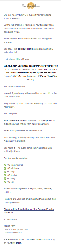
About Revitalize Wellness
Revitalize Wellness is a family-owned health/wellness company specializing in orthomolecular medicine, an approach that emphasizes creating a healthy molecular environment at the cellular level in order to maximize heath and reduce illness.
In short, providing excellent nutrition keeps sickness at bay. Which, at an n=1 level, is true. Better nutrition strengthens your body overall, including the immune system directly.
Revitalize Wellness was founded in 2017 by Katie and Craig Gironda. The idea first came about when in 2014, Katie just could not solve certain health problems despite visits to conventional doctors.
After discovering the orthomolecular approach to medicine, she launched a Facebook group around the topic. It blew up and today has over 90,000 members!
Such success led Katie to launch Revitalize Wellness with her husband, Craig. They focused on pure, affordable supplements without nasty extras.
Since then, the Girondas sold the company to new owners, but Katie sticks around as a consultant and advisor (genius business move).
Part 2 of my Revitalize Wellness Email Breakdown series will dive deeper into the origins since it’s an origin story email.
For now, let’s look at this excellent “call your audience out” email…
The Email: Connecting With the Reader Via the Problem-Solution Framework
Today’s email offers us an excellent example of being real with the reader within a Problem-Solution framework, commiserating with them over a common issue in order to pitch the offer:

This is 100% uncut direct response, as you can see. Plenty of text. Several CTAs throughout. Lots of spacing. Varying formats and sentence lengths for readability.
And the logo and emojis are the only visuals.
But you have to squint to read the email in that screenshot. I know. So let’s look at things section-by-section…
The Subject Line and Preview Text:
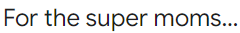
The subject line calls out the audience directly:

It also makes the target audience feel good about themselves (and rightly so). I’m neither woman nor parent, but I know momming ain’t easy.
What moms do is crucial, after all. They’re super moms.
But then the preview text closes the loop set by the ellipsis:

So now the reader knows whatever’s inside is for them, and it helps the thing they care about most — their children.
This will get TONS of opens since it’s in a Welcome Sequence. The audience knows they’re about to hear about the best product for one of their most important goals.
Overall, this subject-preview complex kicks ass.
The Body Copy
The body opens with the Revitalize logo and what some call a “short guy, big truck” opening (a sharp, punchy, confident sentence.)
This particular “short guy, big truck” is an Agreeable one. Parents nod and think “yes, that’s true, Vitamin C is important.”
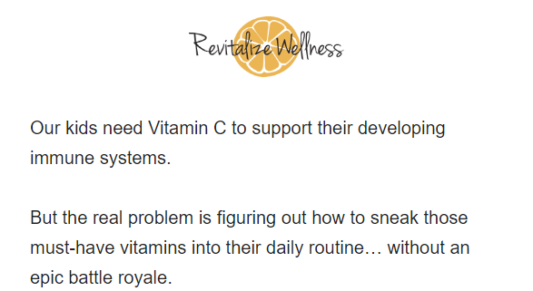
But Revitalize immediately raises the Problem with getting Vitamin C (and other vitamins/minerals) into their diet.
I love the descriptive language here:
- “Sneak those must-have vitamins into…” is much better than “get those vitamins in…”
- “…without an epic battle royale” conjures up images of a parent pinning their child down just long enough to get them to take their vitamins. It makes you laugh and the target reader here has endured such an experience many times.
Being a Welcome Sequence, Revitalize doesn’t offer a short listicle of tips to solve the Problem. Their Solution is one of their child-specific products:
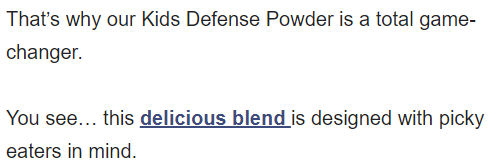
Kids Defense Powder is a catchy name. It’s goal-focused, implying that it helps kids defend against sickness. Much more powerful than “Kids Vitamin C Supplement.”
I like the implicit CTA on the benefit copy. “Delicious blend” is what the parent wants (since they won’t have to engage in the “battle royale” described earlier), so linking it to the product page makes perfect sense.
“Picky eaters” is great, too. Always use language that more vividly describes the problem to the particular audience (parents have a more concrete concept of “picky eater” than nonparents).
Revitalize’s next piece is a testimonial — an excellent addition to overcome objections and build trust:
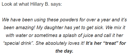
This testimonial covers a lot of ground:
- Time: The customer has used the product for over a year to great success. This implies the product is good, yes, but it also seeds the idea of repeat purchases.
- Results: “My daughter has yet to get sick” is powerful because, as parents know, children can seem like sickness factories. Also, the fact that this customer’s daughter “absolutely loves it” helps out.
- Product Use: The testimonial slides in concrete examples of how a real customer uses the product. This gives the customer ideas on how to use their product… which, as you notice, is future-pacing.
Notice how the last sentence is bolded, too. Parents would love if their kids looked forward to healthy food/drink. So this is quite the sentence to draw attention to.
I love the way the next section illustrates the resolution of the problem:
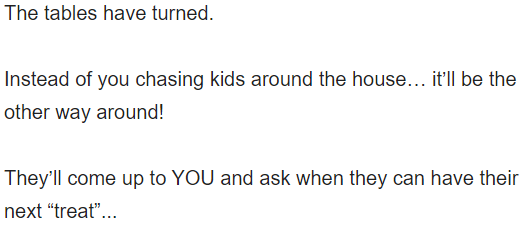
Revitalize shows how its solution solves a real problem by turning it into a “good problem to have.”
Much more vivid and natural-sounding way to illustrate the result the parent wants.
Also, notice how the same word — “treat” — from the testimonial is used. Subtle, but keeps the piece cohesive.
Of course, future pacing the results isn’t enough for all parents. Some are more skeptical. What about the ingredients? Is it clean and safe for my kids? Is it full of sugar or additives?
Revitalize, anticipating such objections, addresses them in the next two sections. First, the “main ingredient”:
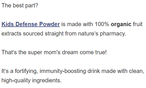
This section does a great job of describing what the ingredient is and why it’s so healthy (meeting the reader’s needs). “Straight from nature’s pharmacy” is a nice bit of metaphor.
Revitalize bolds organic because it’s the most recognizable “health/wellness” term here, too.
Notice how the product name has another implicit CTA, too. Good spot to drop one.
Next, we cover the bad things that are NOT in the product (the implication being that you’ll find these in competing products) while further elucidating why the product is so clean:
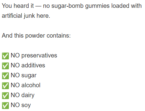
Sugar-bomb’s a good phrase for this market. I like it.
I like the emojis for the other ingredients, too. They’re a fun, fitting way to make a bulleted list out of a “checklist” in an email. They add some color, too, which makes the email nicer to look at.
There’s also the all-caps “NO” to further emphasize the lack of these bad ingredients.
One last bit of copy to put a bow on this email:
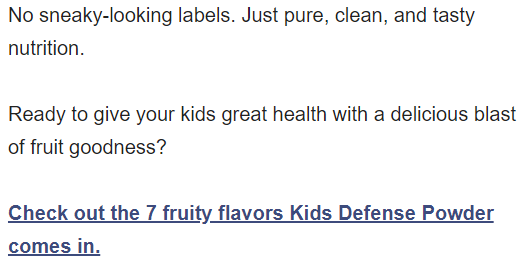
That first sentence is a nice way to tie everything together. It emphasizes the “clean” aspect yet again.
It’s a perfect place to drop the explicit CTA. But this CTA isn’t any old CTA.
It slides yet another benefit in — it urges parents to check out the 7 fruity flavors on offer.
That gets some curiosity clicks since people want to know what the flavors are. It also indicates the breadth of options, obviously, which appeals to more tastes.
And it doesn’t even feel like a “buy now” CTA. It’s more of a “explore our product range” CTA which sells in a more natural fashion.
We conclude with a signoff and PS section:
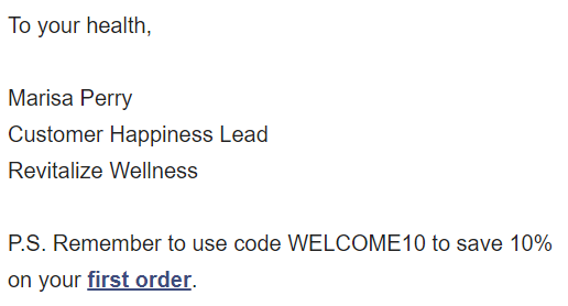
Notice how Revitalize’s emails come from a person instead of the brand. That works quite well for smaller brands “in terms of team size.”
In this case, Marisa is a real person. She’s on the About page. But I love how her title is “Customer Happiness Lead.” Whether or not that’s her official title doesn’t matter.
I’ve created fun titles for clients’ sales reps before to add some personality and it worked fairly well. Also, “Customer Happiness Lead” sounds more positive than “Customer Support Lead.”
Finally, the PS reminds customers about their welcome discount. The implicit CTA is a nice touch, giving readers an obvious way to click through without adding a whole new sentence.
Takeaways
Here are some big takeaways:
1. The Copy Mechanics
Here are some mechanical takeaways:
Implicit CTAs
The implicit CTAs help get clicks from different types of readers. Some people click at the first link they see and get sold by the product page. Others need some more copy and, in this case, to learn what exactly the product is. The remaining use the explicit CTA at the end.
Testimonial Usage
The testimonial in this email adds credibility (customers trust other customers) and covers several potential objections while future-pacing and seeding the idea of repeat purchases. That’s a well-selected testimonial!
Font and Formatting
This email uses several formatting and font alterations to enhance readability:
- Bold
- Italics
- Ellipsis
- Line breaks
- Lists
- Emojis
- All-caps
These break up the text and make it easy to read. It feels more like your focus flows down the page… rather than being dragged.
Conversational First-Person and Second-Person
You noticed the first-person and second-person copy. But how about some of the conversational phrases?
Things like “You see…”, “You heard it —”, and “The best part?” These help smooth the transition between sentences and make it feel like they’re talking to you instead of writing.
Metaphor
Metaphors like “sugar-bomb”, “the tables have turned”, and “epic battle royale” add visuals, make the copy more exciting to read, and can communicate concepts more clearly than trying to convey them in plain language.
Objection Defusals
Notice how Revitalize anticipates and overcomes numerous objections. They go after many without even explicitly raising them first.
Yet they raise others on purpose to connect with the reader and show how they understand the reader’s concerns.
2. The Email Structure
This email’s structure is as follows:
- Short guy, big truck intro (an Agreeable version of this intro)
- Raising the problem
- Introducing the solution (the product)
- Benefit
- Testimonial
- Future-pacing + big benefit
- Objection-defusal
- Objection-defusal
- CTA
- PS section
The email’s skeleton is pretty standard if you look at it. It actually looks a bit like a sales letter. Lesson in there.
The testimonial backs up the “for picky eaters” benefit copy quite well since it shows a real example of this situation. Many people would place testimonials toward the end of their emails, but it fits perfectly where it is in this one.
3. The Overall Strategy
Two strategy takeaways:
Showing the Customer Around
This email’s in a welcome sequence, so one of its goals is to show the customer around the brand. That includes highlighting different products to appeal to a range of customers.
Some emails focus on the flagship product, but this sells a different one that may appeal to a specific subset of the audience (parents). Revitalize did an excellent job displaying its product range without losing focus.
Positioning
This email aims to position Revitalize as a great health/wellness brand for parents since, like I said, they target that audience.
By zooming in on a narrower avatar, they can more easily dominate that slice of the market. A mini “monopoly”, if you will. Thus, they can depend on this segment of parents to be a reliable and loyal customer segment.
What to Do Next
- Get on my email list using the signup form below for more Email Breakdowns and other helpful marketing content.
- Share this with someone who might find it helpful (or entertaining).
- Reach out to me if you want help writing emails like this one.
- Check out Revitalize Wellness for Vitamin C supplements and other wellness products!
1 Reply to “Email Breakdown #89: Revitalize Wellness Part 1”
Comments are closed.