I’ve been looking to upgrade my wardrobe a little bit.
Ditch those nasty polyesters and other plastics for something that’s nice on my skin/the rest of my body.
Things like cotton, wool, etc.
Fortunately, awareness around various taken-for-granted household items — from seed oils to clothing — has gone relatively mainstream.
Since I’m in the gym, sweating a lot, I’ve prioritized gym clothes first.
Fortunately, I have some connections in the eCom space who, naturally, know lots of these brands.
That’s how I stumbled upon Ryker Clothing Co.
I already had some level of trust since, well,
But its website copy and, more importantly, welcome email sold me. So much so that I plan to buy more clothing from Ryker in the future.
For now, let’s look at this welcome email in detail to see why it works so well…
| Table of Contents |
| About Ryker Clothing Co. The Email: A No-Nonsense, “Push-Pull” Welcome Email The Subject Line and Preview Text The Body Copy Takeaways What to Do Next |
About Ryker Clothing Co.
Ryker is a men’s athletic apparel brand that sells gym clothing and underwear made of 100% organic merino wool and cotton. No plastics or synthetics of any kind.
It was co-founded by Garrett Wilson and a man named Ben — I cannot find Ben’s last name unfortunately. I only know he’s the cofounder because today’s Email Breakdown email comes from Ben.
Regardless, the story behind Ryker is simple:
The cofounders were sick and tired of gym clothes made of synthetic fibers and cheap, endocrine-disrupting plastics. They wanted clothes that protected men’s well, family jewels from hordes of chemical invaders.
As the About Page says:
“Do you really want to coat your body in plastic when you work out?”
At the time of writing, Ryker sells shorts, joggers, and underwear. Shorts appear to be the flagship product since many of the ads and other marketing language I see are variations of “Are your gym shorts made of plastic?”
Still, Ryker doesn’t clearly define a “flagship.” It makes more sense to purchase all their products to protect your hormones and enjoy more comfortable gym clothes. Lesson in there for businesses — make ALL your products a customer necessity.
I’m in the gym a LOT, so I already bought one of the three types of apparel they sell. The other two are 100% on my list.
The Email: A No-Nonsense, “Push-Pull” Welcome Email
Today’s email is what I will now call a “push-pull” welcome email. It pushes away the “meh” customers while pulling in those who love what Ryker’s about.
Here’s the subject, preview, and email:


My favorite style of eCom email. Simple, eye-catching design that focuses on copy while some basic visual elements accent the email. Good use of white space, too.
Notice how it’s nice and short. Copy can be long, as long as it’s relevant to the reader. But there is something to say about overwhelm.
So the brevity here may be more attractive to the busy buyer.
The Subject Line and Preview Text
Our subject line and preview text are surprisingly simple. First, the subject line:

See?
The subject line is nothing special. Probably took three seconds to think of and type out.
And does it need to be — especially with the preview text:

Together, it feels less like a sales email and more like a genuine greeting from the brand. The curiosity of receiving the first non-transactional email is enough to get people to open it anyway.
I know I did.
The Body Copy
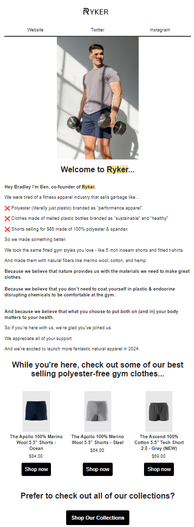
Our email starts strong with a “Hero” section.
At the top is the logo, sized well. Below it is the top menu, offering customers a templatized way to check out Ryker on Twitter and Instagram (along with the website if you want to shop).
That suits their strategy well. They’re a smaller “scrappy” brand with a passion for their mission, and their social media accounts post like real people.
Next is an image of either a model or Ben (who this email comes from). This offers an opportunity to model the shorts and display their aesthetic. The subject of the photo is also clearly in great shape. Adds that “aspirational” touch — fit people who care about their health wear Ryker.
This section ends with a “Welcome to Ryker” headline. It pairs well with the opening of the copy, which we cover next:
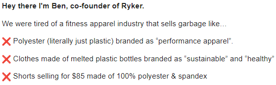
Ben introduces himself, setting a personal tone for the rest of the email. The customer feels like they’re hearing straight from the cofounder.
Ben wastes no time getting into the “why” behind Ryker to show the best customers they’re in the right place. In other words, they “pull” those customers in and push out those who aren’t on fire for this kind of thing.
I love the bullets here. They cover a lot of ground in three sentences:
- Bullet 1: This positions the competition as inferior and, even better, deceptive. “Performance apparel” is made to sound like a fancy way to say “cheap plastic BS.”
- Bullet 2: This adds some dramatic imagery that elicits a visceral reaction. “Made of melted plastic bottles.” Gross! Who wants to wear melted plastic? And they dare say their melted plastic is “sustainable” and “healthy”? It’s a nice bit of snark that “throws stones at common enemies.”
- Bullet 3: A genius way to address pricing. Ryker clothes aren’t cheap. But they are the same or slightly more than toxic plastic shorts. And they’re FAR better for your health.
This stone-throwing positions the “old” plastic shorts as inferior and, frankly, bad for your health.
This is the perfect opportunity to pivot toward what makes Ryker superior:
Again, a ton of ground in a few sentences.
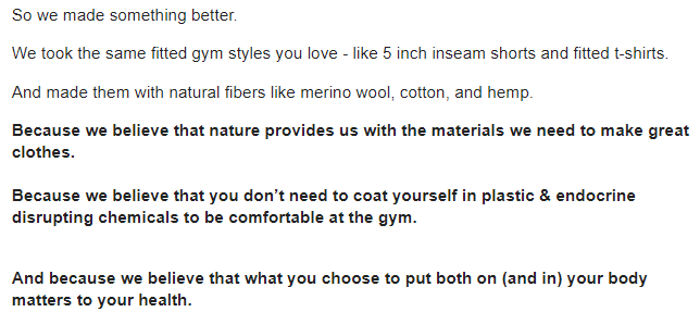
Ben continues the origin story with. “So we made something better.”
The next line defuses other objections, such as style and size. 5-inch inseams look great with muscular legs and offer freedom of movement. Fitted t-shirts, well, look great when you have a muscular upper body.
The third line shows off the materials used. The unique mechanism, one could say, behind their clothes. They’re made of all-natural fibers that are healthier for your body.
Ryker ties the product specifics and objection-defusals back to the broader beliefs about health and nature.
This whole section is bound to sell a lot of customers. It has almost everything a customer needs to make the decision — product details, materials, and outcomes. Masterful.
We conclude the copy with three more lines:
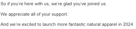
Some nice lines welcoming the customer in once more, sure.
However, the third line is my favorite. Ryker has primed the customer to watch out for new products all year.
Even if the customer doesn’t want ANYTHING Ryker has now, the thought of “they might have new things later!” sticks. They might make it a habit to check the site later.
I bet Ryker’s email person (or cofounder, whoever does it) has a recurring reminder to update the year every January 1. Easy way to “evergreen” an otherwise non-evergreen email.
But the email isn’t finished yet — we have a recommended product block:
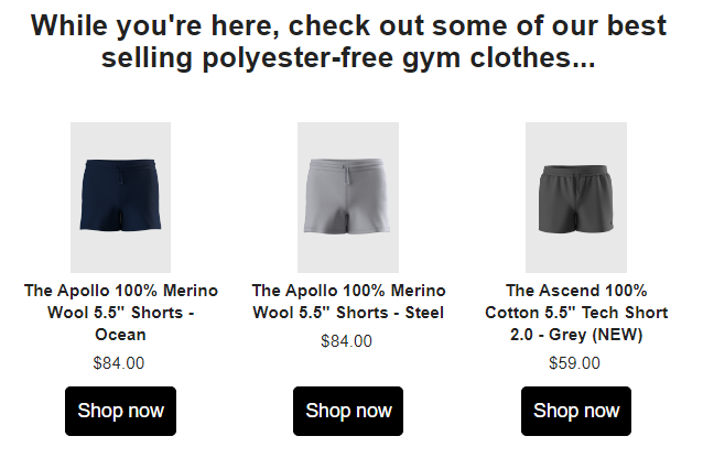
This block lets Ryker present some customer favorites to grab the more purchase-ready readers.
It works quite well since the reader just learned about the products and Ryker’s mission. It also addresses questions about colors.
Notice how two of the products are $84.
Now, recall Bullet 3 from earlier that “called out” shorts made of polyester spandex. What was the price on that?
Oh yeah. $85.
Ryker preframed you to look for prices at or around $85. So now you see $84 as quite reasonable for healthier AND higher quality shorts.
One more block before the email ends:
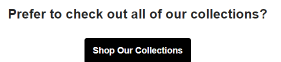
Ryker throws this in for the extra-curious customers (like me) who prefer to see the full selection. Maybe these customers need joggers or underwear. Or perhaps they want to see what else is available.
Either way, the button gives them a place to go.
Takeaways
Here are some big takeaways:
1. The Copy Mechanics
A few mechanical takeaways:
Emoji bullets
Lists convey serialized information in a more condensed fashion. It frames the reader’s mind to see one benefit of your product (or drawback of the competitor’s) after another.
Good bullet writing can be what sells the customer on the product.
I like how Ryker used the ❌ emoji to suit the theme of the list — the bad things that other gymwear’s made of.
Bolding and spacing
Ryker bolded the parts the reader should pay attention to… the “why” behind the brand and its products.
Bolding also enhanced readability by varying the copy’s appearance.
Speaking of readability, there are plenty of line breaks.
Sentence structure variation
Sentence structure variation helps make writing musical. Musical writing’s easier (and more satisfying). It keeps attention, too, by adding a subtle degree of “unpredictability”. No sentence is exactly like the last.
Ryker has short sentences, like “Hey there I’m Ben, co-founder of Ryker.” and “So we made something better.”
But also long sentences like “Because we believe that you don’t need to coat yourself in plastic & endocrine-disrupting chemicals to be comfortable at the gym.”
It even has medium-length sentences like “And we’re excited to launch more fantastic natural apparel in 2024.”
First- and second-person language
Ryker’s email comes from Ben, the cofounder. It uses “I,” “we,” and “you.” And not in a generic sense, either.
The email feels like Ben is telling you about these clothes for the sake of your health, not “men’s” health in general.
Style touches
Miscellaneous style touches make this feel much more like a personal communication than a marketing email:
- The word “literally” used as a general emphasis (yeah, this angers language nerds, but this is marketing, not high art!)
- Strong descriptive language like “garbage,” “melted plastic bottles,” “coat yourself in plastic…”
- “Scare quotes,” the use of quotation marks around words/phrases to draw attention and indicate an ironic or mocking tone. In this case, “sustainable” and “healthy” when describing competing products made of melted plastic bottles… or “performance apparel” when referring to polyesters used in most athletic apparel.
Price anchoring
One of Ryker’s stone-throwing bullets is “Shorts selling for $85 made of 100% polyester & spandex.” This does a few things:
- Cheapens competing products… after all, plastic is supposed to be cheap garbage
- Frames Ryker’s own similarly-priced products as, well, a great deal given the premium materials used (especially products less than $85)
2. The Email Structure
This email’s structure is as follows:
- Logo + top menu
- Hero image + headline
- Positioning against competitors
- Objection-handling
- Unique selling point
- Brand values/”why” behind the brand
- Recommended product block
- General CTA
See how Ryker starts by explaining the problem with the status quo, then introduces itself as the solution.
It mirrors the customer journey, in a way. The customer is in an undesired, unfinished stage that has pains and problems. Mainly, garbage plastic clothing.
Ryker introduces its superiority afterwards to demonstrate where the reader could be.
By doing this, Ryker sets an anchor for the norm to show why its products are even better.
This structure is more effective than if Ryker has talked about themselves first. The reader would have started with Ryker’s quality, rather than have something to compare it against.
3. The Overall Strategy
A basic Welcome Sequence aims to nab that first sale while introducing customers to the brand.
If this was all Ryker aimed for, it could have just said, “Thanks for getting on our list! Here’s a discount. Our clothes are great, made of XYZ. Shop now.”
Ryker goes above and beyond. Its Welcome Sequence aims to create lifelong customers from the very first non-transactional email. It does so by being unapologetic in its values and coding its competitors as gross and low-quality.
Subsequent Welcome Sequence emails back up my point. The second one urged the reader to check their existing gym shorts and see what they’re made of to prove the brand’s point. Makes the issue feel all the more real.
It gave the reader a choice of continuing to wear plastic clothes or joining the men protecting their health with Ryker’s all-natural clothing — relating to the intended audience’s pains in the process.
Genius!
What to Do Next
- Get on my email list using the signup form below for more Email Breakdowns and other helpful marketing content.
- Share this with someone who might find it helpful (or entertaining).
- Reach out to me if you want help writing emails like this one.
- Check out Ryker for gym clothes made of 100% all-natural fibers, like cotton and merino wool… and stop coating your body in endocrine disruptors! They only have men’s clothes, but ladies, buy some for the man in your life. I know I’d love gym clothes as a gift 😉