So I was hunting for new email lists to jump on recently.
Hike Footwear looked like a great choice. They sell an eCom product and they were hiring for an Email Marketing Specialist (that’s a good sign they “get” email).
I was expecting to break down a welcome email…
And instead was pleasantly surprised by a Site Abandonment Flow — a flow that triggers when you merely visit someone’s site.
I thought I had “invented” this flow, and yet, I thought wrong. So let’s see how Hike Footwear does it…
| Table of Contents |
| About Hike Footwear The Email: A Site Abandonment Flow Email The Subject Line and Preview Text The Body Copy Takeaways What to Do Next |
About Hike Footwear
Hike Footwear is a footwear company that provides feet-friendly shoes that help customers enjoy walking/hiking outside without foot pain.
Their shoes are “barefoot” shoes, meaning an ultra-thin sole that connects you to the ground more. This helps your balance (vital for walking correctly and avoiding injury).
Feet are some of the most nerve-dense parts of the body, so allowing them to get close to the ground makes walking feel more natural, I believe.
The shoes also allow more room for the toes. Turns out many modern shoes cramp our toes together, creating problems with walking and increasing the chance of certain injuries.
Return to shoe tradition, so to speak.
(Xero Shoes is another great company with a similar focus on foot-friendly shoes.)
The Email: A Site Abandonment Flow Email
Today, we’re looking at a Site Abandonment email.
I got this about 20 minutes after leaving the site — without viewing a particular product:


Good structure at first glance. A blend of copy and simple design elements that attract the eye without cluttering the screen.
Let’s look at each section in more detail…
The Subject Line and Preview Text
The subject line is fairly standard for the segment of people we’re targeting:

When combined with the sender name (which is Hike Footwear), the reader has enough information to piece things together:
The email’s about footwear comfort… something the reader’s interested in since they visited the site not long before they got this email.
Next, we have the first sign this is some sort of abandonment email:

Questions like this almost always work well in this context. It catches the attention by being “intensely personal” and revs up curiosity by asking a question.
So send name + subject + preview get the open.
The Body Copy
We start with a hero image:

Excellent imagery. The man’s body language conveys bliss and joy, which:
- Shows that he’s enjoying the great outdoors, AND;
- Implies he’s doing so free of foot pain and discomfort
Both of these are relevant to the target audience.
Also, note the message at the top of the image. As we’ve seen in previous Email Breakdowns, hero images are a great place to stick your risk-removals/special offers. Not too intrusive, but gives the reader some persuasive info that potentially closes the sale.
Now, for a superb headline:

It speaks to the market’s pain point (pun partially intended) and promises a permanent solution.
It gets the reader imagining what life would look and feel like if they finally beat foot pain.
We have the reader’s attention. Can we keep it?
I think so:

This section “twists the knife” while explaining on multiple levels why the reader has such bad foot pain.
Not just that your foot feels pressure… but it’s that the pressure scrunches your muscles, tendons, and bones. Ouch!
Notice how it removes some of the blame from the reader. It’s not their fault for foot pain… it’s the modern shoes they wear.
There are “underdog” and “retvrn to tradition” sentiments here.
Hike is showing how Big Shoe is screwing the reader over with shoes contrary to human anatomy.
Which helps put Big Shoe “over there” and as the “bad guys,”… setting up Hike to be your ally in the fight against foot pain.
Their weapon, of course, are shoes fitting the natural human foot. A “retvrn” to what worked.
Great positioning.
Next section is where I knew for sure this was a Site Abandonment Flow:

Hike acknowledges it saw the reader’s interest and demonstrates its desire to help.
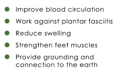
The rest of the copy gives a blurb about what exactly Hike sells. Then, the bullets explaining how what Hike’s shoes and boots do that solve the reader’s problem:

Usually, I’d recommend elaborating on why each bullet is important.
But I think that would make this type of email too long. This isn’t a sales letter for one product to cold traffic, but rather, a “reminder-esque” email giving a quick overview of the brand and its various products.
(Hey, each of those bullets could be topics for other problem/solution or list-style emails).
I like how the bullet points are green. A tiny bit of extra effort to increase brand congruence. It’s the little things.
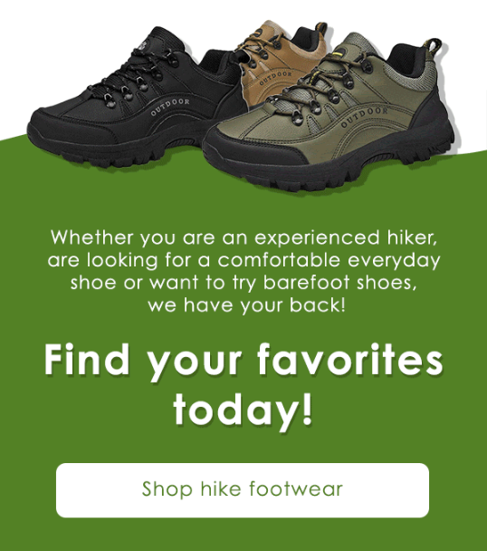
We arrive at Hike’s CTA:

First thing to note: That image of shoes is actually a gif. It starts with zero shoes. Then, that tan shoe appears, followed by the black shoe, then the green shoe.
It’s just flashy enough to draw your attention toward the CTA section without being annoying. And it cleverly displays the color options.
The copy casts a wide net since lots of people of different goals and backgrounds deal with foot pain.
The email body has ended, but there’s one more block:

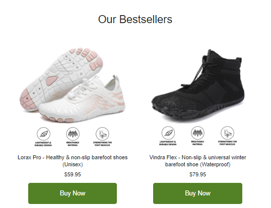
A product block.
This one happens to show Hike’s bestsellers. Wise decision — your bestsellers make for natural front-end products.
I like how they added those icons and copy in the images. I know you can’t read them, but they say things like “breathable material”.
Even just having those there, though, is a good sign to the reader. The brain feels like it’s getting more info at that lizard brain level. It just feels more legitimate.
Takeaways
Here are some big takeaways:
1. The Copy Mechanics
I like the big font and brand colors throughout. Readability and consistency matter for the overall experience.
Similarly, bulleting the benefits helps the reader remember what the shoes offer while pulling them down the page.
Zooming in, that first paragraph of copy is excellent framing. Not only does it state what the problem is…
But it explains the science behind it. The reader knows the brand isn’t BSing.
The “your foot pain isn’t your fault” may sound like helplessness/victim mentality…
But it isn’t. Because ultimately, Hike doesn’t remove all agency. The reader can choose to continue suffering from pain or alleviate it by buying the Hike shoes.
Kinda my philosophy on things.
Your bad situation may not necessarily be your fault. But it’s on you to fix it.
2. The Email Structure
The email structure is as follows:
- Hero image
- Headline
- Pain point copy
- Product benefit copy
- CTA
- Recommended product block
Note how the product block is at the bottom. This ensures the focus stays on the brand and getting them to the site with minimal distraction…
But providing the most skeptical readers some options at the bottom if they still aren’t convinced to click.
Also, notice how the hero image section is big enough to get attention but small enough NOT to obscure the headline and some body copy above the fold. This subtle detail can dramatically increase the number of people who read the email.
3. The Overall Strategy
The strategy for Site Abandonment Flows is to either start a conversation with the customer to answer questions or, if you tweak it, make sales.
I’m partial to the former, but Hike did the latter well because it “introduced itself” and had a few lines of educational and positioning copy.
One other strategy element to note:
I can’t tell if Hike set this to trigger after one or multiple visits… Because I was on the site several times before I received it.
Either one could work, depending on the email content. A more personal “hey, have any questions?” One works better for visitors who visit multiple times within a timeframe.
One thing I’d try is segmenting customers by the reason they’re getting shoes.
If the viewer’s a hiker, you could talk more about hiking and the importance of being grounded, and then direct them to your boots. Whereas if it’s someone who just has foot pain, you can hone in on that pain.
What to Do Next
- Get on my email list using the signup form below for more Email Breakdowns and other helpful marketing content.
- Share this with someone who might find it helpful (or entertaining).
- Reach out to me if you want help writing emails like this one.
- Check out Hike Footwear for comfortable, thin-sole shoes that help you walk pain-free!
