(NOTE: This is part of a series. Check out Part 1 here.)
Fun fact:
I almost did a different brand for this particular post.
But when the Bright Cellars email below hit my inbox, I couldn’t turn down the opportunity to break it down.
It offers an excellent lesson in selling based on the customer’s desired outcomes and goals — something I haven’t covered enough in other Email Breakdowns.
See, customers don’t care about your product. They care about what it does for them. Your copy must paint a picture of them enjoying that result.
Bright Cellars didn’t just talk tasting notes. They appealed to the customer’s desired results.
I know it works because if I could subscribe to red wine delivery right now, I would have bought the Bright Cellars Red Wine Variety Bundle (advertised in the email below).
Keep on reading to see why this email is so good…
| Table of Contents |
| About Bright Cellars The Email: Selling on Outcomes… NOT Products The Subject Line and Preview Text: The Body Copy Takeaways What to Do Next |
About Bright Cellars
Bright Cellars is an online wine club offering a diverse array of yummy-looking wine bundles (can you tell my research for this Breakdown made me thirsty?) and margaritas.
(Check out this post for another wine club Email Breakdown.)
Customers can purchase bundles a la carte…
Or sign up for a paid membership to unlock discounts.
The one-off option’s there to try the wines. Then, when the customer loves their selection, Bright Cellars nudges them toward a membership.
Excellent business model.
I should also mention — the bundles have outcome-focused names like “Dinner Party Bundle” or “Red Wine Variety Bundle”.
This helps customers identify which one they need. Reduces decision fatigue and analysis paralysis.
Bright Cellars was founded in Milwaukee, WI, by Richard Yau and Joe Laurendi in 2014 after they graduated from the Massachusetts Institute of Technology (MIT).
It all started as an algorithm that matched paid members to personalized wine selections. It’s a $40M/year brand as of 2022.
The idea behind the Bright Cellars:
“Finding wine you love shouldn’t be this hard.”
Which means their mission is akin to “breaking down the ‘snob’ barrier,” so to speak.
Wine can feel like one of those “snob” hobbies (I’ll coin the term “snobbies” here).
Getting “into” wine can be intimidating. People around you seem to “get” wine, yet you don’t. Most of the “good” wines are above your pay grade. And you don’t want to look “stupid” by asking questions, spending hours researching online, or wasting thousands of dollars on bad wines.
Now, look at Bright Cellars’s beliefs:
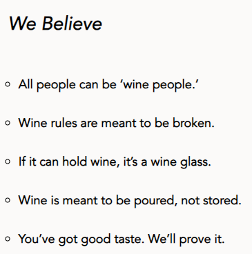
I can identify with all these.
So I love this.
Wine is wine. Some people like some wines, other people like others. Bright Cellars offers what looks like a nice range.
But what makes customers buy again and again from Bright Cellars is its very mission.
The brand takes a STAND. They alienate some people, perhaps, but the best customers say “YES. This is who I’m looking for.”
Absolutely masterful mission-crafting.
(Psst: My very first Email Breakdown covered an email from an “anti-snob” brand in the firearms space, Pew Pew Tactical. Check it out for another great example of the “anti-snob” angle.)
The Email: Selling on Outcomes… NOT Products
This email is short and heavy on design — but it’s one of those good design-based emails:


See? Nice and neat. Not cluttered. Simple color scheme. And there’s copy to do some selling.
Let’s see how that copy performs…
The Subject Line and Preview Text:
You can see the “goal focus” in your first encounter with this email — the subject line.

I got this email in mid-January 2024. Wine lovers naturally want wine that fits their circumstances.
They don’t want XYZ red wine. They want the best wine for Scenario ABC. Outcome/goal-focused.
I appreciate the emoji use, too. Relevant emojis catch the eye, convey the idea differently, and add a dash of fun.
Our preview text builds nicely on the subject line:

Love how they “commanded” the reader here. Another little nudge toward opening the email.
Also, notice the lack of capitalization. Such a strategic breaking of grammatical rules catches more attention in the inbox.
The Body Copy
Like in Part 1, we start with something akin to a “banner ad” at the top. This one’s advertising a benefit of Bright Cellar memberships:

That alone will score a few new members, whether they buy immediately or after reading the email.
Best part:
Customers who don’t become members get little reminders about the money they could save as members. The longer they wait, the more they miss out on.
Next, the hero image, copy, and CTA:
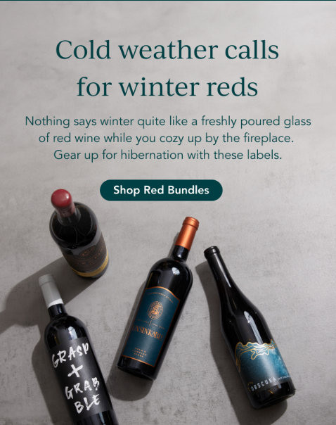
Bright Cellars pays off the subject line with a big claim: “Cold weather calls for winter reds.”
Crucial to assert yourself. Customers trust you to make decisions for them. That’s the point of focusing on outcomes. “Cold weather can be a great time for winter reds” would NOT work. Good on Bright Cellars.
The brand builds on the headline with some awesome copy.
Rather than say anything about the wine or some boring science about the product…
Bright Cellars paints a mental picture of life with the wine.
Customers can see themselves cozying up by the fireplace with a glass of red as the snow comes down outside.
They can do that with any red wine. But they’re on Bright Cellars’s list, they trust Bright Cellars, and there’s a membership offer available.
It’s all about the outcome.
Some people will click through with that button. But others may be more skeptical. So Bright Cellars includes their red bundles in the email.
Each offers a CTA to that bundle’s product page for ease of purchase.
Each has some good copy, too — let’s take a look, starting with the Red Wine Variety Bundle:

The appeal here is pretty broad. It’s for anyone who isn’t super picky and just wants a variety of reds (people like me).
They’re a bit more indecisive. They don’t want to miss out. They haven’t tried a lot of wines yet and need as much variety as possible.
The copy expands on the variety aspect by explaining how these are highly-rated reds from around the world.
So you get to feel cultured as you enjoy a geographically diverse selection.
Next, the Palette Knife Bordeaux Red Blend Bundle:
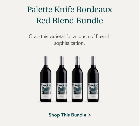
Fancy French name. The copy plays up this angle, too.
This one plays to the reader’s desire for sophistication and status. Particularly for those in the audience who know a bit about wine. France is known for fine wine, after all.
Just study the copy, though. It’s rhythmic and descriptive. It’s great.
We move to the Premium Wine Bundle:
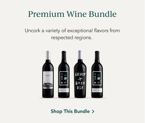
Sounds similar to the Red Wine Variety Bundle… but not exactly.
Rather than a “world tour” of highly respected reds, this focuses more on the most respected regions.
I checked, and yes, fewer regions are represented.
So this one targets those preferring to stick to the tried and true wine regions.
Notice, so far, how every bundle had an action word: “Indulge. Grab. Uncork.” Bright Cellars balances descriptive copy and action copy.
We move to our last bundle, the Worst Evils Red Blend Bundle:
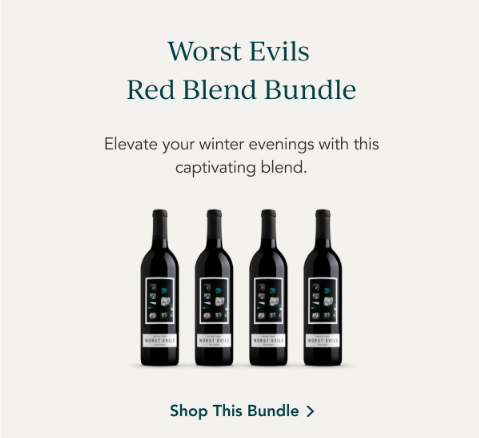
I don’t know where this brand of wine got its name. But I’ll tell you one thing:
It sticks in your memory…
It makes you curious…
And it has a bit of an attitude to it.
The name alone secures some curiosity sales.
Then, there’s the copy.
It ties back to the “winter evening by the fireplace” aesthetic Bright Cellars brought up at the start of the email.
Smart: If none of the other bundles interest the reader, and you have no other “big outcomes” for the reader to experience… you can always fall back on the email’s opening angle for one bundle.
Love the action word here: “Elevate.” Not “improve” or “make better”… “Elevate.” Keeps the copy fresh and fun to read.
Takeaways
Here are some big takeaways:
1. The Copy Mechanics
The main mechanical takeaway is how Bright Cellars used descriptive copy to:
- Paint a picture in the reader’s head of life with the wine
- Appeal to the reader’s desired outcomes
The hero section’s copy hits #1. Every bundle’s bit of copy hits #2.
Subtle detail: Did you notice how each wine bundle had the actual number of wines pictured?
The Red Wine Variety Bundle had six wines pictured, and it came with six bottles.
Each other bundle has four bottles, and their images each had four bottles as well.
Bright Cellars didn’t have to do that. But going the extra mile for congruency pays off by eliminating ALL confusion and, again, reducing the amount of thinking needed during purchasing.
Last thing:
Every word has to earn its place in good copy.
Not a word was wasted here.
Keeps the copy sharp, hard-hitting…
And pulls the reader to the next line.
2. The Email Structure
The email structure is as follows:
- Nonskeptical customer CTA
- Hero section (which pays off the subject line)
- Background image
- Headline
- Copy
- CTA
- Bundle section
- Each bundle
- Headline (the product name, in this case)
- Copy
- Image
- CTA
- Each bundle
Notice how simple each “substructure” is within the overall structure. The same few elements are present — headline, short copy, image, CTA.
The product names themselves serve as fairly compelling headlines, too. Shows that Bright Cellars knows how to name products. Lesson in there.
3. The Overall Strategy
There’s no “grand strategy” that this email is a part of. It doesn’t seem to be part of a launch campaign or a series of themed emails.
But the email itself does have three strategic takeaways:
First, it builds authority/trust. Every good broadcast you send that has even an ounce of education builds a bit of trust.
Bright Cellars reinforces its expert image by confidently recommending wines based on outside circumstances. They’re showing up in the reader’s inbox with helpful info, even when there isn’t a lot of copy.
Second, it’s themed on a timely event. Bright Cellars found a way to use some sort of timely event (in this case, a season) to justify the email.
I bet they could run campaigns (or even flows!) themed around the seasons EVERY SINGLE YEAR.
Summer wines, fall wines, winter wines, spring wines.
Maybe each email in those flows features a different bundle. Get some copy about ways to enjoy your wine during those seasons, too. I got ideas on ideas here.
(Bright Cellars — if you’re reading this, go ahead and steal them from me.)
Third, it sells customers on outcomes while providing the product as a bridge to that outcome.
So it’s not just selling the winter wines. It’s selling the cozy aesthetic of sitting under a blanket by the fireplace with a glass of vino. That’s what the customer wants. It evokes deep emotions.
And for the individual bundles, the customer never has to think about “which wines do I want to drink?” Bright Cellars did the thinking for them. They removed the “analysis paralysis” that stops a buyer in their tracks.
Not only is that good copywriting… but it fits Bright Cellars’s positioning of being the wine club for the “average Joe.”
What to Do Next
- Get on my email list using the signup form below for more Email Breakdowns and other helpful marketing content.
- Share this with someone who might find it helpful (or entertaining).
- Reach out to me if you want help writing emails like this one.
- Check out Bright Cellars’s tasty wine bundles!
