Giveaways are a common business tactic for getting a lot of responses on whatever your goal is.
For example, maybe you give away a free product for the best social media post featuring your product.
Boom. Tons of user-generated content (UGC), and your product gets in front of your customers’ friends and eyes in a positive light. You might even appear in “Featured” sections or searches on social media.
Or how about as a lead magnet?
Give away one free product every month with an ongoing giveaway. Get a flood of signups each month. Get full margin on your Welcome Sequence’s sales since you don’t give a discount to every new customer.
If the math works out, and you’re good about keeping the number of “freebie-seekers” in check, you “lose” one product’s COGS and shipping but widen your margin on every sale.
There are two use cases. But what if you leveraged a giveaway to:
- Get tons of engagement
- Sneak in promotional copy about a new product
- Nudge customers toward your top-seller
- Remind customers about your loyalty program (scoring you more sales)
- Hint at a way customers can save on their next purchase (again, more sales)
- Highlight your brand’s charitable initiatives (and show how the customer has helped)
ALL with one email…
Without that email going a million different directions?
Hint Water has done just that. Keep on reading for all the details.
| Table of Contents |
| About Hint Water The Email: A Clever Giveaway/Product Announcement Hybrid The Subject Line and Preview Text: The Body Copy Takeaways What to Do Next |
About Hint Water
Hint Water is a fruit-flavored water company offering sugar-free, unsweetened, 0-calorie flavored waters. Hint sells flavors by the case. Customers can place one-time orders or subscribe to monthly delivery and save.
Hint has a ton of variety:
- Still water: Individual flavors, like cherry or blackberry.
- Smashups: Two flavors in one bottle, like strawberry watermelon or cherry blackberry.
- Variety: Variety packs that mix and match flavors based on themes, such as tropical, summer, or red fruits.
- Hint + vitamin: Still water with vitamins added.
- Sparkling: Sparkling versions of various Hint flavors.
- Kids: Several Hint flavors that come in fun, colorful juice boxes.
- Bundles: Buy multiple cases and save. Comes in 3, 6, and 12-case iterations.
Hint was founded by Kara Goldin, who also served as CEO for a long time.
Before Hint, Kara worked at AOL. After becoming a mom of three kids, she wanted to focus more on family and living a healthy lifestyle.
At the same time, she was unhappy with all the sugars and preservatives in most juices. She wanted fruit-flavored drinks that weren’t so unhealthy.
In 2005, Kara created the formula that would become Hint Water — water and flavors only from 100% natural fruit — in her own home and started selling Hint products out of her garage.
A classic American entrepreneurship story.
The company took off and her husband, Theo Goldin, eventually came onboard to become COO.
In 2011, Hint launched the Sparkling line I mentioned earlier. In 2017, the company even expanded into sunscreen!
Today, Hint’s worth hundreds of millions and is known for stocking the fridges of many a Silicon Valley company break room.
Hint also partners with Feeding America, donating at least 10 meals to people in need for every:
- Case of Hint Water sold in physical stores with a Feeding America in-store display
- Case of Hint Water’s “Feeding America Bundle” (12 of each: Watermelon, Pineapple, and Blackberry) sold online
Hint has donated around 1.75 MILLION meals at the time of writing. Great stuff.
The Email: A Clever Giveaway/Product Announcement Hybrid
Today’s email is a short giveaway that mixes copy and graphics but packs in many creative ideas.


The email is visually pleasing. More graphic-heavy, but not flashing bright colors in your face. There’s a good use of white space (or, in this case, light-orange-brown space).
The Subject Line and Preview Text:
The subject line uses a classic formula: Curiosity + benefit, but with a slight twist:

Rather than “How to do XYZ,” it’s “ Do X to win Y prize.” See how flexible the curiosity + benefit formula is? It doesn’t just suit problem-solving emails.
I like how the number “6” is in there. Rather than “Win free cases of Hint” it’s “Win 6 cases of hint”. That avoids the word “free” which may trigger spam… but the specificity grabs the eyes.
And hey, 6 free cases of Hint is almost $140 of product. Not bad.
Finally, “Crack the code” invites some mystery and challenge. A code? A code for what? Now the reader wants to see if they can crack it.
Our preview text strengthens this last point:

A question that further invites the reader to try their hand at the challenge inside.
Hint also works in the word “giveaway” to alleviate any uncertainty about whether or not this is, well, a giveaway.
The Body Copy
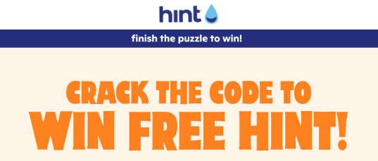
The body starts with the Hero section:

It’s almost always wise to stick your logo at the top. Immediately triggers all the associations the customer’s mind has with your brand.
Below it is “finish the puzzle to win!” urging the reader to take action.
It also hints at (no pun intended) the ease of the challenge. The word “finish” implies it will only take a minute or so.
Finally is the big orange headline, reiterating the big promise.
This time, Hint uses “free,” which is a better place to use it since there’s less spam worry, and the reader is already hooked thanks to the number 6.
Speaking of, we get to what I would call the body copy:

The puzzle is revealed to be a crossword.
The “show what you know” copy is nice. It again challenges the reader and preframes them to feel smart for “knowing” something and showing it off.
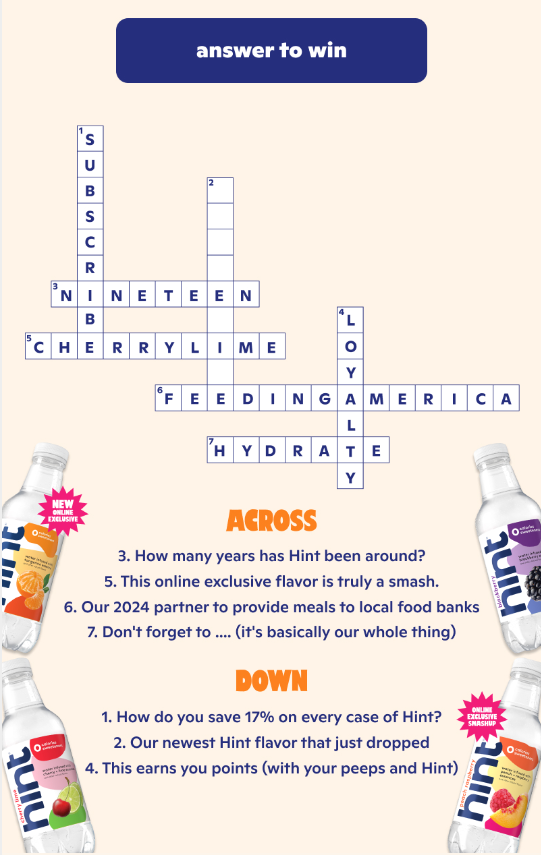
Next comes the crossword itself:

Like I said, the crossword is mostly finished. It’s on the reader to answer the last one…
And that’s where the “product announcement” element comes in.
See how the hint is “Our newest Hint flavor that just dropped”? That causes the reader to learn that Hint has a new flavor to check out…
And now, they want to find out what it is so they can enter the giveaway!
Thus, they do their research to enter and, in the process, have a good chance of buying that new flavor (and perhaps some others). Especially if they’re a loyal customer.
That’s just one clever use of a crossword hint. Look at the rest. Most are Hint flavors or other benefits of shopping at Hint, with a sprinkle of Hint fun facts for good measure. The answers are filled out, creating a fun way to remind the reader of these things.
I enjoy the bottles of Hint at the side and the big, bold orange “ACROSS” and “DOWN”. Nice style touches.
(And yes, it’s not lost on me that Hint is using a crossword puzzle, which involves several HINTS.)
One last piece of this section — the CTA button is at the top and says “answer to win.” Being clear about the action to take never hurts.
Overall, one of the coolest ways to include some interactivity into the email.
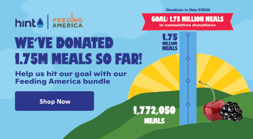
A few more elements to cover, starting with this charity highlight block:

Hint highlights its charitable impact… or, rather, the customer’s impact.
If you have a charitable initiative or partnership, you should highlight it wherever relevant. Customers like to know their dollars support good causes.
Not only does it feel good…
But they get to feel like they’re part of something bigger. THEY donated a few of those meals.
Feeding America drops a “Shop Now” button there for this reason.
One more section:

This footer is a bit more unique than others.
It allows readers to sign up for SMS and offers a discount. Clever way to capture already-engaged customers for the SMS list — especially if, for some reason, they didn’t sign up initially.
Oh, and it’ll make them another sale (even if that sale is at a lower margin).
Takeaways
Here are some big takeaways:
1. The Copy Mechanics
Not much from a mechanical standpoint here. The biggest lessons here are the use of spacing and the fun, personality-driven copy.
Oh, and the “Show what you know” language. Giving customers a friendly challenge ignites that “I have to show how smart I am” feeling in them, boosting engagement.
2. The Email Structure
This email’s structure is as follows:
- Logo + Hero Section
- Headline
- Copy
- CTA 1
- Puzzle + Hints
- Charitable Block + CTA 2
- Footer
Notice how the CTA comes before the puzzle. People who already know the flavor can click through and answer without doing the puzzle (or maybe they just want to buy).
Then, people who don’t proceed to the puzzle. It’s the classic technique of giving multiple CTAs for readers at different levels of “purchase readiness.”
3. The Overall Strategy
There are a lot of mini-strategic takeaways, from sneaking in product mentions to reminding customers of the loyalty program…
But they all flow from the real strategy takeaway:
Test fun, interactive emails with your list — with giveaways, of course.
Simple puzzles are great, especially if you can work in several selling angles. Hint did that here with the loyalty program reminder, charitable partner mention, and more.
A VERY simple word search could work, too, in certain circumstances. Maybe circle a few of the selling points, then have the reader click through to type in the final word.
Or perhaps just make the word search itself really obvious with like 3 or 4 words and have the same task — click through and enter the words for your entry.
What to Do Next
- Get on my email list using the signup form below for more Email Breakdowns and other helpful marketing content.
- Share this with someone who might find it helpful (or entertaining).
- Reach out to me if you want help writing emails like this one.
- Check out Hint Water and explore its selection of refreshing, fruit-flavored waters!
